 |
| Artist – @samdoesart |
If you don’t have an idea about how to color digital art, then don’t worry because You don’t have to be a professional to color digital art.
In fact, digital art is even easier to paint than traditional art.
With the help of the following steps, you can easily color your digital art in two or three hours max.(depending upon your detailing)
So let’s walk through the simple 5 steps to coloring digital art and you would love the final result.
How to color digital art?
1. sketching –
 |
| Artist – samdoesarts |
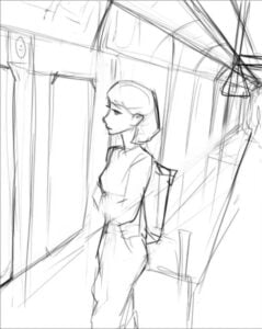
Before coloring, the first part of making a painting is sketching.
Because sketch is the skeleton of the work. It gives an idea about how the painting will go further.
While sketching the main characters or background you have to decide the certain points like
- Choosing the right reference images
- Anatomy of characters
- Position of the main character
- Story building
- The flow of painting
While sketching you don’t have to go into detailing, instead of you have to work on fundamental structures of characters
You can do sketching as rough work.
2. How to choose colors for digital art
While coloring digital art choosing the right colors is so important.
Remember the following three points while choosing colors-
- Point of emphasis
- Color harmony
- Color temperature.
Before applying color to the digital art you have to decide your point of emphasis in your painting.
Emphasis simply means the focal point of your painting.
By choosing the right colors you can shift your focal point anywhere.
How can we decide the focal point in our painting?
In painting, any character or maybe an object or something big natural structure anything you find important is your focal point.
Any object you want to people look into first in your painting is your emphasis or focal point.
So choosing the right color for emphasis is so important.
How to choose colors for emphasis?
Creating emphasis doesn’t mean you have to always color your focal point with dark or vibrant colors.
You can make your focal point popped out by various methods
If you painted the background with vibrant colors then you can paint your focal point with dull colors vise versa
If you painted your background dark then you can paint your focal point with light colors.
Color harmony –
Color Harmony means The combination of simultaneously applied colors to produce a pleasing effect.
In color harmony you can use
complementary colors & Triads
complementary colors means the colors which are opposite to each other in the color wheel
And the triads are the three opposite colors to each other in the color wheel.
We can use opposite colors to create emphasis in art.
Color temperature –
Usually, in color temperature, people misunderstood that only reddish colors are warmer colors and blueish colors are the coolest colors.
But that’s not true at all,
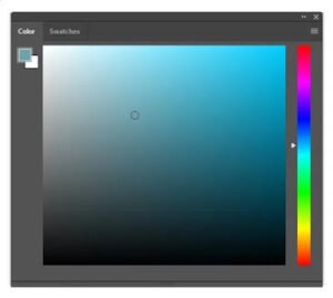
In the color wheel, the upper layer was all vibrant and saturated as compared to the lower layers.
You can pick any color from the upper layer and compare it with the lower layer. Then you can clearly see the all warmer colors are in the upper layer and cooler colors are in the lower layer
You can use warmer color to you emphasize your main character or face with cooler colors in the background.
3. How to Color background –
 |
| Artist – samdoesarts |
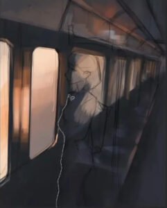
The background is the secondary character of the painting and I would always recommend doing the background first before you staring to do detailing on the character.
It has multiple reasons because if you do your character first and then going to the background then it seems like a green screen behind the character
The lighting and environment did not match with the character if you do character first.
Start painting the background with bigger shapes and do not overwhelm with details.
Use the “laso” tool to work on different parts of the background
Your background must be telling some story to viewers.
Background not only informs lighting on the character but also sets the mood of the environment.
Usually, the Background doesn’t have too many details.
because if you really seeing the character in front of you then you cant see the details in the background
so don’t do over detailing on the background just create lighting and little details.
4. How to color Character –
 |
| Artist – samdoesarts |
Clipping mask-
Before starting to paint the character you have to make a clipping mask to the character.
You can do it by selecting the outline of the character and make cling mask
It will allow you to work on the only character.
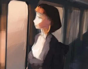
Then You have to cover your whole character with the base color. It will be anything like orange or grey.
Then sharp this character and remove extra lines or parts that you don’t want to.
Apply flat colors –
After applying base color you can start painting characters with flat colors
If you painting realistic paintings then you should pick up colors with low saturation because in real life colors are not so vibrant.
You can divide body parts by clipping the mask to apply colors in sharp edges.
Shadows –
 |
| Artist – samdoesarts |
After applying flat colors to the character you can now start with shadows
Look at the background where is light coming from and apply the shadow according to it.
Lighting –
 |
| Artist – samdoesarts |
Lighting is the most important part while painting a character.
Due to light and shadows character looks popped out.
So whenever you painting a character, make sure there is some color contrast and light on the character.
5. Final detailing/ retouching
 |
| Artist – Samdoesarts |
After all the steps you can do final detailing or retouching.
In this step, you can Flip the canvas to see your minute errors and then fix them.
After all the chaos finish the painting with color dodge and changing some saturation and contrast If you want!
Also check out : Review: Veikk VK1560 Pen Display

